If you want to skip the details, I’ve created an infographic guide for consistent color from DaVinci Resolve to QuickTime to YouTube and Vimeo with QuickTime Tags. In it, I describe project settings, monitoring options and export settings from Resolve to maintain expected color through delivery. Click the link at the bottom of the article to download the guide if you want the good stuff!
Color Space Tagging Changes Introduced with macOS Mojave and Resolve 16.2.2
Before really this article, I recommend taking a look at my previous article here first. This will give you a basic understanding of QuickTime tagging and display profiles in the Mac OS ecosystem:
Three things changed since I published my last article about color management and Mac OS systems:
- “Use Mac Display Color Profiles for Viewers” changed with Mac OS’s later than 10.14.6 Mac OS Mojave and Catalina and with later versions of Resolve.
- Blackmagic added the option to embed color and gamma tags on the deliver page under the advanced video settings.
- Blackmagic released a new version of Resolve (16.2.2) with the new Rec709-A color space to address the disconnect between Apple’s color tagging and Resolve’s color space tags.
We’ll get into it below.
If you’d rather not read through the explanation and just want to know how to maintain color between Resolve, QuickTime and YouTube/Vimeo, download the short, simple PDF guide below:
Change #1: Color Space Settings in Resolve Match QuickTime tags in Resolve’s viewer
For the first change, “Use Mac Display Color Profiles for Viewers” works the opposite of how I described it in my last article. Specifically it works differently in OS’s later than 10.14.6. In previous OS’s, checking that option would mean that your viewer would NOT match QuickTime with the timeline color space set to rec709 gamma 2.4.
Previously, Resolve’s viewer would look like it was tagged with 1-1-1 QuickTime tags. On export, Resolve embedded tags as 1-2-1 for rec709 gamma 2.4. The exports would look much darker in QuickTime than Resolve’s viewer. By re-encoding the file with something like HandBrake or Adobe Media Encoder, the tags change to 1-1-1 and THEN the re-encoded QuickTime would match the Resolve viewer. This is what I illustrated with my last article.
In later OS’s past 10.14.6, with Mojave and Catalina, checking the “Use Mac Display Color Profiles for Viewers” means that QuickTime WILL match the viewer with the properly encoded tags 1-2-1 for 2.4 gamma. So if you export your file and your timeline color space is Rec709 gamma 2.4 which are the default project settings, the QuickTime render will contain 1-2-1 tags.
Re-encoding these files with something like Handbrake would remove the 1-2-1 tags and change them to 1-1-1. That encoded file will no longer match Resolve’s viewer in QuickTime.
The most important thing to know about the viewer in Resolve after OS 10.14.6:
1. If “Use Mac Display Color Profiles for Viewers” is turned on…
2. Then the Timeline Color Space defines how Resolve’s viewer displays files…
3. And Resolve’s color spaces should match corresponding embedded QuickTime tags in source files and renders.
For example, if an original camera file has 1-1-1 tags in QuickTime and it is imported into a Rec709 2.4 gamma project in Resolve and “Use Mac Display Color Profiles for Viewers” is turned on, that file will appear as if it has 1-2-1 tags. It will look darker in Resolve than it did in QuickTime because the tags don’t match.
In the same way, if files are exported with tags set to the default “Same as Project,” those tags will be embedded in the QuickTime file and match Revolve’s viewer.
This is really great. Color spaces in Resolve match QuickTime tags. However it’s tough to tell which color spaces correspond to which QuickTime tags. Only by rendering the file and checking it in QuickTime can you tell which tags were embedded. It would be great if there was an option to see these tags somewhere in Resolve.
Another problem with this change is that Resolve displays QuickTimes with 1-1-1 tags as 1-2-1 if the timeline color space is Rec709 Gamma 2.4 and “Use Mac Display Color Profiles for Viewers” is on. So the source file in QuickTime and Resolve’s viewer don’t match. This can be really confusing especially when rendering files with 1-2-1 tagging and then re-encoding to 1-1-1 leading to shifts everywhere. The next two changes provide solutions for this issue.
Change #2: Color Space and Gamma Tags on the Deliver Page
Blackmagic added the ability to select custom color space and gamma tags on the Deliver page with Resolve 16.2.1. By default, the color space tags will match the Timeline Color Space or Output Color Space if the project is color managed. Changing the Color Space Tag and Gamma Tag will override the project settings and embed the user selected tags.
Keep in mind that tagging doesn’t actually change the encoded pixels of a render. They simply tell other applications that can read them how to display the color.
Because of this, tagging files is more flexible than burning in specific transforms for various displays or color spaces, but can also lead to more confusion based on which application is viewing the files.
Changing your tags while rendering provides flexibility, so that you don’t have to switch the Timeline Color Space to embed different tags. It would be great if there was an option to see the QuickTime tag numbers with these tagging settings in Resolve so you could have an idea which color spaces correspond to which tags.
Change #3: The Rec709-A Options
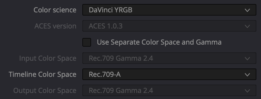
Blackmagic also added a new color space option in Resolve with version 16.2.2 of Resolve. The rec709-A color space in Resolve matches how QuickTime tags 1-1-1 files. Most QuickTimes are tagged as 1-1-1 by default. Rec709-A can be selected as a project color space, as an input color space if using a color managed project and a gamma tag on the deliver page.
By changing your timeline color space to rec709-A and using rec709-A render tags, your project will match QuickTime renders AND when the file is re-encoded, no shifts will occur. There will be no shifts from Resolve’s viewer to QuickTime and then to YouTube, Vimeo etc. For internet only deliveries or for users without a professionally calibrated monitor, this new settings provides an easy option.
The Impact of These Changes
With the addition of these options, Blackmagic is really starting to close the gap for mastering content to the internet. There are limitations with color managed and un-color managed applications beyond Blackmagic’s control. There are also limitations with browser and video hosting sites that are beyond Blackmagic’s control. But at the very least, it’s a huge help that Resolve’s viewer matches QuickTime and Mac’s color ecosystem.
I believe these issues are why Blackmagic added the rec709-A option in the latest version of Resolve 16.2.2. While my PowerGrade from the last article can still be used for non-color managed workflows, the rec709-A tag option and timeline color space makes it much easier to do what the PowerGrade does.
Using rec709-a tags is very simple and makes it much easier to match viewers and exports in Resolve and beyond. While in theory rec709-A tags are great, figuring out how to use them in existing workflows can be a challenge.
That’s why I’ve created an easy to use infographic reference that explains best practices for grading and tagging from Resolve. It also includes information for understanding any color shifts between browsers like Chrome, Safair and Firefox and video hosting sites like YouTube and Vimeo display on Mac displays. By using this infographic reference, you can easily setup your project and pipeline to ensure the colors you see are what you deliver.
Download the infographic reference here!:
Since color management is such a moving target, even this information might not be accurate within a few months. We’ll do our best to keep you updated on the best ways to work and how to maintain consistency for your clients.
A Quick Word About Using Professional Calibrated External Grading Monitors and QuickTime Tags
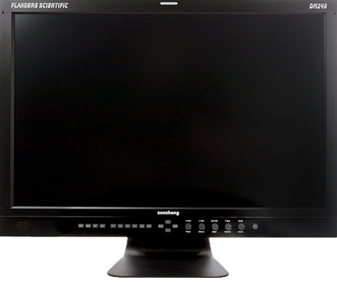
In doing these tests, it’s important to mention that I have my own Flanders Scientific DM240 at home. When looking at bars with my eye between the full screen viewer in Resolve, the default bars with “Use Mac Display Color Profiles for Viewers” turned off is much more saturated and brighter than the Flanders.
Turning on “Use Mac Display Color Profiles for Viewers” and setting the color space to Rec.709-A actually matches the best between the two monitors. This seems to point towards using Rec.709-A as the Timeline Color Space so the viewers match.
Since a calibrated broadcast monitor and Resolve’s unmanaged viewer don’t match well and because of the addition of rec709-A as a color space, I recommend against using the non-color managed workflow I suggested in my last article. Most applications on Mac computers are color managed as well so it makes sense to keep our files in that space.
However, there are reasons why rec.709-A as a Timeline Color Space might not be a good option for your workflow.
If you’re a professional user, rec.709 Gamma 2.4 is the standard color space and has been since the dawn of HD video. The controls are familiar, the color transforms work as expected and it’s a standard deliverable color space. Not only that, but working with a calibrated external grading monitor within a well defined standard color space is still the de-facto standard way of working for professional colorists for a variety of reasons.
While that is still the case, since Resolve has become so accessible to editors and a larger group of users without a grading monitor, I believe it’s still important for users to understand how to maintain their expected color appearance on Mac monitors even without a grading monitor.
If you prefer to still work in un-color managed type workflow, you can still use my PowerGrade from the last post. However, I’d actually recommend working with tags instead. Since Resolve now has the option to grade while also seeing how your files will be tagged in rec709-A, it will be much easier to leave “Use Mac Display Color Profiles for Viewers” turned on.
The Next Step: Maintaining Color From QuickTime to YouTube & Vimeo
Now that we’ve establish how the new tagging tools work in Resolve, the next step is testing what happens to the colors from QuickTime to YouTube and Vimeo on an Apple display.
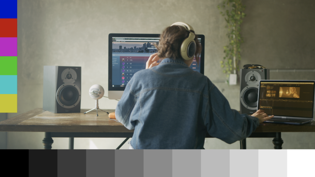
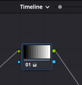
I’ve created my own test video file for this purpose. It contains color bars at the top as well as color overlays and a grey 10-step ramp, all created in Resolve. This way we can see what happens to standard color bars as well as a real world images when uploading and compressing video files to the internet.
For my Resolve settings, I set the Timeline Color Space to rec.709-A (1-1-1 QuickTime tags.) I lightly graded and exported the sequence from Resolve as a ProResHQ 1920×1080 QuickTime file at 23.976 with matching QuickTime tags (1-1-1.) The bars and ramp are all created from Resolve’s standard generators.
Special shoutout to www.RawFilm.com for providing a bunch of free R3D files to download and use for free. Check them out for some great looking raw stock footage.
I uploaded ProResHQ files directly to YouTube and Vimeo as well as made transcodes from HandBrake to .mp4 h.264s. Here are the shots.


You can download the ProResHQ sources here if you’d like to use them to test your uploads well.
These are three main browsers that we’ll test with the Mac OS.
- Safari
- Chrome
- Firefox
Of those three browsers, we’ll also test these two major video hosting sites in each browser:
- YouTube
- Vimeo
By doing these tests, we’ll have a much better understanding of what happens to our colors after QuickTime.
System Specs Used for Testing
For full disclosure of my software and hardware used in these tests, please refer below. My hardware and software are fairly modern and standard Mac equipment for a professional user.
Hardware
Computer: iMac Pro1,1
Processor: 3 GHz Intel Xeon W
Memory: 128 GB 2666 MHz DDR4
Graphics: Radeon Pro Vega 64 16 GB
Software
Mac OS: 10.14.6
DaVinci Resolve: 16.2.2.012
QuickTime Player: Version 10.5 (935.5)
Safari: Version 13.1.1 (14609.2.9.1.3)
Chrome: Version 83.0.4103.116
FireFox: 78.0.1 (64-bit)
Chrome & Safari
In my testing, both Chrome and Safari matched QuickTime and Resolve’s viewer with uploads to Vimeo and YouTube. Chrome and Safari are color managed by the Mac OS. Not only that but Vimeo and YouTube both expect 1-1-1 QuickTime tags for HD video.
Since the files that I’ve exported and converted for upload to Safari and Chrome also contain 1-1-1 tags, there weren’t any major shifts in color from Resolve.
Below are 4 frames from the video test. The first is Resolve’s viewer with “Use Mac Display Color Profiles for Viewers” turned on and the Timeline Color Space as rec709-A. The second is screenshot from a ProResHQ export. The third is a screenshot from an mp4 upload from HandBrake to YouTube. The fourth is a screenshot from an mp4 upload from HandBrake to Vimeo.


They all match fairly well.
A Magenta Shift with H.264
However looking a bit closer, I came across something interesting. There appears to be a slight shift from the ProResHQ QuickTime to the H.264 mp4. The Red and Blue channels are slightly brighter than the Green channel so the images appear very slightly brighter, more magenta and less green than the source file. You can really see it in the black and white step ramp at the bottom of the images.
I tested this with a few different encoders from Resolve’s h.264, to Adobe Media Encoder, to HandBrake and also YouTube and Vimeo. This magenta push shift appears to happen everywhere. This could be a result of my particular hardware or some other unknown variable.
This is by no means a major color shift. But for those who are particular about their colors remaining consistent, it does feel different than the source.
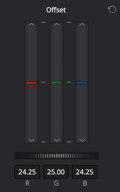
If your final deliverable is living on the internet and you’re seeing this shift, what I’ve done is added a timeline node to shift everything away from that magenta. Here’s a comparison of the original source and a tweaked Youtube upload with magenta subtracted.
Keep in mind when getting this detailed comparisons screen uniformity will come into play so where the image is on screen might look slightly different as it moves to different positions on the monitor. You can also use the Digital Color Meter software that comes with Mac computers to sample colors on your display.
The settings I’ve used are below. I applied the offset at the timeline level so it’s at the end of the grading chain. The offset settings seemed to be the closest to matching QuickTime and Resolve’s viewer.
This is by no means a necessary step for uploads to the internet. But for that extra mile or to really make sure you’re not driving yourself crazy, this is one option to really dial in the colors for final deliveries.
4K and YouTube
The other interesting thing that I discovered is an issue with 4K uploads to YouTube. Since these tests are all HD, there weren’t any surprises with color shifts. But in testing out a 4K upload to YouTube, the colors shifted fairly drastically.
Below is a screenshot from a 4K upload on YouTube. Greens are way neon, contrast is different, magenta is dark, other colors are different.

As quality and resolution are beyond the scope of this article, I’m not going to dig into this particular issue yet. My guess is that YouTube expects a different color space with 4K material. If anyone has experience with why this is the case, please comment below.
Vimeo doesn’t seem to have this issue on 4K uploads.
Firefox & VLC
Firefox is the odd man out in my tests. By default, Firefox is not color managed within the display profile like Safari and Chrome. Therefore, YouTube and Vimeo are not color managed with FireFox. FireFox will match VLC and Resolve’s viewer if “Use Mac Display Color Profiles for Viewers” is turned off.
There are options for changing this default behavior in Firefox, but I couldn’t find an option that worked for videos in particular on YouTube and Vimeo. For that reason, I’d suggest against viewing your files in Firefox and advising clients to do the same.
Conclusion
By understanding QuickTime tagging, you can make sure there aren’t any color shift surprises after leaving Resolve.
Color management is difficult and confusing even for experienced professionals. It’s really helpful to have a guide or reference to use when you forget or get stuck. That’s why I created the infographic below. Articles are helpful, but when you’re in the heat of battle or just need something to check, it’s easier to have small bits of information tailored to your specific issue.
The infographic describes in detail how to work with QuickTime tagging and color grading. It describes simply how to match color from Resolve to QuickTime to YouTube and Vimeo. Depending on your particular hardware, I included options for a variety of work environments and deliverable types so even if you are a professional colorist and use a calibrated grading monitor, you know how tagging can integrate into your workflow.
It’s a short 10 pages that can really help you choose the right way to grade your footage and make sure it matches what you see on the internet and beyond.
If you’ve subscribed in the past, I’ll send this free infographic out to your email address. If you haven’t subscribed yet, enter your information below and I’ll send you a free copy of the infographic.
Tagging isn’t well documented yet, but it has such a huge effect the final color of your masters on internet. Not only YouTube and Vimeo, but FaceBook and Instagram are used to display work now. By using this reference, you’ll have the confidence to trust your work for your clients by understanding how tagging works so that they are seeing what you saw when grading.
I hope this article has helped you find your way through tagging, QuickTime and matching colors across Mac displays and applications. Drop a comment below if you have any questions or feedback.
Thanks for reading!
Thanks a lot for updating this, ive been through all this mess with rec 709a myself a few weeks ago.
What is still very much confusing me is that i have an XDR display which uses a rec709 reference mode with 2.4 gamma and not p3 but rec709 colors. So its basically like an external pro display.
I did my own little series of tests and I got the following matches:
Using the Display in Rec 709 and not using any tags, I get matching output if I use only standard rec709 tags in the following:
Resolve on the ProDisplay
Premiere without Color management
VLC
iPad Pro
If I turn on Rec 709A And use mac display profiles and tag accordingly, I get matching results in
Resolve
QT
The biggest confusion comes from that when I swtich the XDR then back to P3 and look at my results, everything will be completely different again. I really think this display needs a dedicated write up. If you wanna get into more testing, I‘d be happy to assist.
I can turn rec709a on everywhere and can get consistent results as you described throughout the entire pipeline resolve/qt/yt
Sorry, need to comment again after doing some more testing, because this is driving me nuts:
Final results, with the XDR driving in Native Rec709 Mode.
If I switch „use mac profiles“ in the viewer on and work in Rec709a and export with according tags, I get the exact same image in Resolve, Quicktime Prores, Quicktime h264 and Youtube/vimeo on Mac.
Premiere, VLC, Firefox look different but that is to be expected. But what is really bothering me and I think it should be mentioned here, since many people use an ipad as a final check: The videos look different when viewed on ipad.
And the joke is, that ipad basically displays everything like if color management is turned off. „Use mac display profiles off, and Rec709 2.4“ That image translates perfectly through the ipad, both in a h264 sent to the photos app, and if viewed on youtube on Safari on iPad.
So that kinda makes me wanna not use Rec709a at all, because yes, if you‘re only on mac computers, and not looking at the video in Premiere or Firefox or VLC, it pretends to give you a nice looking result, but as soon as you leave that environment, things start to fall apart when the ugly truth comes out 😀
Argh!
What version of iPad are you using? Is it a later model?
The tough thing with any color management is if you’re using a different device to watch something, it will look different. Part of the importance of grading to a dedicated color space standard. At the very least, being able to keep the shifts to a minimum on the tool that you’re working with is helpful.
I’d love to test all the variety of common devices to see where the shifts happen between each but that’s a fairly involved task for obvious reasons.
Using a dedicated external grading monitor here, the closest match perceptually in Resolve’s viewer was Rec709-A. So sticking with that seems to work best. Maybe the solution is creating one mananged and one non-managed master for the variety of viewing devices…
Hello, Dan!
I’m use:
Mac OS Mojave 10.14.6
Only one monitor for grading – iMac 27″ 2013 (sRGB) and my own calibrating icc profile with X-Rite i1 Display Pro
Set in Project Settings – Rec709 2.4 (As default)
“Use Mac display color profile” is turned OFF (If i turn ON – black color is clipped)
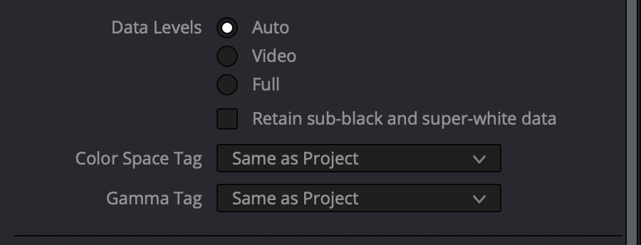
Data levels – AUTO
Color Tag and Gamma Tag – Same as Project
But after export in QT – colors and blacks wash out and some magenta tint in video.
What should I do in my case?
Thank you!
Hi Evgeny. Thanks for the comment. Turning “Use Mac display color profile” off will mean that your QT export won’t match your viewer. It seems like there might be an issue with you icc profile if you’re seeing black clipped when you turn it on.
You could use my PowerGrade from an earlier post at the end of your chain and set the gamma tag to Rec709-A. That might at least mitigate some of the issues you’re seeing.
Great job! In fact we have been applying similar steps since DaVinci versions were upgraded. Nowadays we are able to match DaVinci with Quicktime again, after a lot of combinations. But still have small differences with Wistia. But the worse is that stills exported from gallery, for approving color, don’t match. It seems to be applying sRGB for this proposal. If I reconfigure a project, changing to sRGB, then the stills match but not the exported movies…
It’s definitely not easy with color management and beyond sRGB displays. It would be great if stills from the gallery had similar tagging options so that everything matches. There are workarounds of course, but that’s a good feature request IMHO.
You named it. We have made a lot of combinations. 1-1-1 tag is the best for a workflow where we need to generate several proxies that need to get the tag attached. Other kind of tags, 1-2-1, 1-4-1, 1-13-1 are suitable for single users and online projects. We need to share media, proxies, stills in a team. DaVinci 15.3 was better for this.
Definitely important to work out how to use tags project by project. Depending on your workflow, one option might be better than the other. 1-1-1 is kind of a necessary evil at this point, but hopefully as tags continue to be implemented, more displays, browsers and applications will come to embrace a standard.
I have been trying to solve the color/gamma shift problem for MONTHS. None of the fixes I’ve read online worked. Nothing was matching for me. My source file, the Resolve viewer, the rendered video, and my YouTube uploads were all different. It was beyond frustrating. I just gave up and stuck to Final Cut Pro. I downloaded your pdf guide and tried Option 1 with little hope it was gonna work. It literally took a few seconds to change two things while leaving my deliver/render options untouched. It worked like a charm! Finally. Everything matches now! Thank you so much for your guide, Dan!
Man, thanks so much for the comment Miguel. Truly grateful. So glad it worked for you! I know how frustrating it can be when it seems like nothing is working and you’re hitting your head against a wall. I hope Resolve can now be a great tool for you!
Key info is still missing in the whole article.
Rec.709-A is a way around and works only on MACs.
Another key info. Rec.709-A use for timeline means you are grading to 1.96 gamma, which is nothing desired when doing a proper job.
You should always grade to 2.4 (or 2.2) and then if you need to output for watching on MACs then add conversion to Rec.709-A and use this 2nd version just for MACs preview.
Thanks for the comment Andy. While I agree with you that Rec.709-A is an imperfect solution, for working on mac displays, it is a huge help in my opinion. Especially if your work is only delivering to the internet not a standardized display color space and your clients are primarily mac users. In my guide, I walk through using a standard display monitor set to 2.4 or 2.2 depending on the deliverable which is ideal for any higher level color grading. If mac displays are used, then using Rec709-A tags can be applied on the output, essentially the same as what you suggested. I’ve thought about including information about 1.96 gamma, but thought it might add more confusion about color space settings. Thanks for the suggestion.
Yes, but Rec.709A will still look different on PCs where most players use math based on 2.2 (or 2.4) gamma.
There is simply no proper solution atm. One of the reasons is lack of universal BT.1886 tag. Why it was never introduced I have no idea ( they did introduce some for HDR needs).
Another solution is to use something very random which is in the middle of all possible options, so 2.1 gamma.
Rec.709A does what most post apps have done for many years now for HD video which is use 1-1-1 QT tags. The problem isn’t just the gamma, it’s also the display. P3 Mac displays interact with the tags differently than let’s say a non-Mac display so yes on a PC, things will for sure look different mostly due to the display, not the tags. It would be great if all displays matched and tags communicated properly with displays and display profiles but unfortunately, they don’t as of yet. It really depends on who your clients are, how you want your masters to look and making your own choices as you suggested. A calibrated external display is still the best way to ensure that your master looks correct in a standard color space, but for the internet, it’s mostly a balance between what you saw on your external and what your clients view it on. Thanks for the comment.
Display accuracy problem is another issue..
Whole problem is plain simple:
– you graded video to 2.4 gamma with Rec.709 gamut then tag should say so
– you graded to 2.2 gamma then tag should say so
– you grade to P3 agains tag should say so
– etc.
Rule is simple- tagging should always match real nature of graded video (gamut+gamma). If you then have properly working color engine (OSX one does work okish) then your end preview will be properly converted to display profile. Rest is an accuracy of your display profile, but this is a separate problem.
Atm. 1-1-1 tag can mean few different combinations+ it also means that different reverse math is used for it depending if you are on Mac or other device. Until universal tagging is introduced (eg. at least for Rec.709 2.4 gamma) which is also interpreted properly, problem will never disappear.
You can’t anymore assume that video is Rec.709 (or Rec.601) at 2.2 gamma, like it use to be for very long time and blindly display it with such an assumption. We passed this stage of ‘simplicity of video displaying’ already few years ago.
Hi Andy. I agree with you, universal tagging is key. It seems like that’s what Blackmagic is attempting to do by implementing tags. How the display profile reads and converts the tags for the display is another story. Should it convert the color space to the display color space or should it display the color space within the gamut and gamma of the display color space without converting? Either way, there are issues to contend with between a variety of software and displays.
Each software manufacturer would need to support those universal tags as well as browsers, display profiles, etc. And then also each format would need to support it, not just QuickTime.
It’s simple in concept, but not really in implementation.
Unfortunately, there aren’t really any standards gatekeepers for the internet like the broadcast world or film world. Even Netlfix has standards built upon broadcast and film engineering.
Most software and browsers still assume video is Rec.709 even with tags. With HDR, it’s a little different on YouTube/Vimeo, but the vast majority of content is still created in Rec.709. With software like Resolve, Baselight, Nuke, that is obviously changing, but for deliverables on the internet, there isn’t really any standard. You shoot for close.
Thanks so much for putting together this update post. I read your last post about the color shift with Resolve and Mac P3 displays and it was so helpful – thank you!
Since then, I’ve been using your PowerGrade method, with Use Mac Display Color Profiles turned OFF, and a timeline color space of Rec709 Gamma 2.4.
I’m on an iMac Pro with the standard P3 display color profile that it ships with. Unfortunately, I do not have an external calibrated reference display.
Now I’m reconsidering my workflow yet again. Most of my deliveries are for internet, but occasionally a client will want a video for broadcast television.
So here’s my question –
If I were to use your new recommended method #1 for Internet Only deliveries for those with no reference monitor:
Timeline Color Space: Rec709-A
Use Mac Display Color Profiles for Viewers: Checked ON
Would there be a way to then convert this back to a Rec709 Gamma 2.4 color space without having to re-grade the whole project? Could you do this with tags on export? Or, say something like a PowerGrade similar to your last one, but that would do the opposite and convert us back to the standard Rec709 Gamma 2.4 color space?
Essentially, I’m trying to be the least destructive as possible in my grading environment, so I would have the ability to export for different delivery/color space scenarios if necessary.
I know having an external grading monitor would be the best option, but I’m interested to hear your recommendation for this issue given the equipment I currently have.
Thoughts?
Hi Brandon, thanks for the comment. You could use a color space transform in Resolve to go from Rec709-A to Gamma 2.4. You could also work in a color managed environment and set your output to Rec709-A for internet deliverables and then change to Rec709 Gamma 2.4 for broadcast deliverables.
The challenge is not having a broadcast monitor calibrated to Rec709 Gamma 2.4 so you’d be flying blind so to speak. You’d have no real way of checking the conversion. There are also a lot of other standards like 100 nits, ambient lighting conditions and a lot of other factors for working in a standarized color space. You wouldn’t really know what it should look like since you only have the iMac screen which generally puts out a lot more light (nits,) are more saturated, P3 conversions etc. Ideally if you had broadcast work, you’d start from the broadcast monitor and create internet deliverables to match that as best you could.
Totally makes sense. Thanks Dan.
I haven’t been able to justify a good external monitor yet as the amount of deliverables for broadcast I do per year is 1-2 at most. I think going the Rec709-A, and using the Mac Display Color Profiles method may be my best bet for now, and the most seamless/easy option for most of my work. I appreciate the response!
At the very least, you could always check on a TV too and look at the mac and TV side by side assuming the TV is decently accurate. But that could lead you down another rabbit hole if the TV isn’t!
Thank you for the amazing work, Dan. Much appreciated!
Thanks for the comment!
Having looked into this for those of you without a professional display here is what I recommend.
– buy an i1 display pro and calibrate your screen to rec709 gamma 2.4 100nits
– Grade in a darkened (not pitch black) environment
– Set Resolve to rec709 gamma 2.4 across the board.
– Switch use Mac display profile to OFF
– After completing the grade in Resolve you can now output to your specific destination. For broadcast television just leave Resolve output gamma tags to same as project.
– For QuickTime on a Mac or Vimeo/YouTube via safari or chrome on a Mac use a colour space transform node and set the output gamma to 709-A. Set the the node to 0.75 (75% of the effect) in the key window (where 1 is 100%). Then set the gamma tags on the deliver page to 709-A (1-1-1). You will now find that QuickTime and online will look very close to a calibrated broadcast display / your calibrated GUI on a MacBook Pro and iPhone. I use 75% of the effect for the colour space transform node because I find that in general MacBook Pro and Iphone displays are more contrasty so it’s a better match to a calibrated display. Note that VLC will NOT look correct, bringing the file back into premiere or Resolve will also not look correct so this is for online / QuickTime viewing on a Mac only. I have not tested this across PC’s and Firefox. To get an overall balance across everything 50% of the CST node might be more appropriate
Thanks Keidrych. Appreciate you laying out your own solution for the issue.
Keidrych, after 3 days of testing, this was pretty much my solution as well and the best result. Great to see someone else have exactly the same settings that worked out 🙂 Still not perfect, I see a bit crushed blacks and it’s less saturated, but close enough.
Dan, your first article saved my project so thank you so much for writing this!
After I calibrated my monitor with i1display pro (using displaycal), this didn’t work for me anymore. So I just found your new article, but unfortunately this didn’t work for me at all. Vimeo looked very different from Resolve and QT in Chrome. QT looked slightly different from Resolve as well. Could be something calibration related.
I’m ordering Flanders DM240 as we speak as I’m extremely tired of this problem 😀
Hi Alice, thanks for the comment! Glad to hear the article helped. It’s tricky with ICC profiles that aren’t Apple. Did the tags change after exporting and uploading at all? Or were they 1-1-1 across the board? Having an external broadcast display is a great step in trusting your imagery according to a standard. Hope it works well for you!
Hi Dan!
I just saw your reply a few months later!
Since last time i switched back to native imac calibration and i’m using it together with flanders dm 240. It makes me understand what people are viewing on consumer screens better, but also my ICC profile made such a mess out of everything.
Now, for broadcast delivery you just use REC709 with gamma 2.4 right?
I tried to deliver that to the editor, and he said everything was extremely dark on his end. Also viewing my exports, QT looks super dark and VLC looks good (and VLC matches Flanders). So should I still deliver with 2.4 knowing that it creates tags 1-2-1? The editor is working in Premiere imac 2011.
My imac display profile for viewer is off, if i turn it on it doesn’t match flanders as much.
Also for Vimeo delivery I found that gamma 2.2 worked better for me than rec 709-A, the last one crushed the darker scenes too much.
I tried to deliver the same file for clients to review on vimeo and desktop, but it’s just not looking consistent at all.
Adding rec 709-A tag actually helped eliminate this gap between QT and VLC a little so i have more confidence in it than exporting with gamma 2.4, but 2.4 is the standard so what do I do in this situation? Internet delivery and client reviewing is one thing, but delivering for broadcast is another. But I am seeing this 1-2-1 tag, and 2 is unspecified so i feel like that’s one the editor saw it as way too dark on his end.
Sorry I have a stream of thoughts now, I’m exhausted from researching this topic, hope any of this makes sense.
Thanks!
Hi Alice! Good to hear from you! Yes for broadcast delivery I’d use rec709 with 2.4 tags that match my timeline. It will look dark in QT due to QT being color managed and your mac display not being 2.4. Keep in mind that tags don’t actually affect pixels. Tags help your display profile interpret the pixels for that display. So the question of 2.4, rec709-a, gamma 2.2, it’s like another layer of paint on a house. The house is the pixels in your file. Unless you bake in a transform, tagging won’t change your picture. It’ll just help whoever’s viewing it see it closer to your Flanders ideally on whatever display they’re using.
But the thing with tags is that not every program keeps them or is color managed. Your file will look different on different apps. So apps like Premiere (by default) or VLC aren’t color managed. And if you create any other file from that export with a program that isn’t Resolve, those tags will generally default to 1-1-1. Exporting a file for Premiere for example will look different in the Premiere viewer if that file is tagged with something other than 1-1-1. When that editor exports your file from Premiere, the tags will revert to 1-1-1 anyways BUT the file will still look different in QT than they did before because the tags are different. If he was also looking at the file on a calibrated monitor set to rec709 2.4, it should look the same as yours. So you could give him 1-1-1 tags and call it a day.
When you say for Vimeo delivery, do you mean you used gamma 2.2 tags when exporting or gamma 2.2 in your project settings? For broadcast, the only way to see it properly is on your Flanders assuming it’s been calibrated and set for rec709 gamma 2.4. What I do for any internet viewing or client viewing if they’re viewing on their own Mac display is use rec709-a gamma tags on the output. Then the tags are 1-1-1 and it looks fairly close to my Flanders.
Hope that helps Alice! Feel free to ask any more questions.
Hey Dan!
This is my response to your reply below, but I’m not seeing the “reply” button right under your comment so I had to click mine again 🙂
Anyways, thanks so much for your quick response.
So that was exactly my issue with the tags. I understand i have to send them the broadcast delivery files. But the editor and director add this 1-2-1 file (gamma 2.4) to their premiere (not calibrated monitor) and they see that it looks like trash (based on their description what they see is what I see on QT).
After which they try to view it on their phones, laptops, and it also looks like trash.
When I tried to explain that it’s for rec 709 gamma 2.4 viewing ONLY they got super mad at me saying “it’s supposed to look good on EVERYTHING”.
Then they view it on Vimeo, and it looks way more washed out which makes sense. Again, same response – “make one file look good on everything”, in spite of broadcast delivery standards.
So now I’m just exporting a file with “Rec 709-A” tag because they just refuse to listen to me and don’t trust me anymore as a colorist because 2.4 looked so bad on their end.
For Vimeo I added CST gamma 2.2 and the same tag, it looked more vibrant and closer to flanders on my end. Rec 709-A CST plus tag technically worked (at 70% key) but the dark scenes were extra dark.
But I think I’ll have to basically deliver one file for everything cause they’re losing their patience and don’t understand the gamma shift issue (I’ll still deliver DCI P3 separately). It will go through Premiere after, so what’s even the point of exporting 1-2-1 tags.
So I don’t know what my exact question here, I guess if you had to deal with something like this before 😀
Thanks.
Have you tried just leaving it gamma 2.4 and only changing the gamma tag to Rec709-A instead of a CST? Then the file should look the same in QT, Premiere and Vimeo/YouTube. I have noticed in Premiere that the gamma looks right, but gamut looks oversaturated by about 25 percent likely due to not being color managed. When you export from Premiere and view in QT or Vimeo, it should match however. Again pixels aren’t changing, it’s how Premiere interprets the file.
I wouldn’t recommend baking in CSTs when rendering cause that will change your pixels. Not only that but if you bake in a CST and use a different tag than 1-1-1, your file will look different again once you’ve uploaded or transcoded. If you export your 2.4 file with a rec709-a gamma tag,
This is one of the drawbacks of doing color for content that is only released on the internet. There is no standard. If the director and editor are comparing the file on different screens, it will look different. Every single video on YouTube will look different on different displays. The closest you can get is to make sure what you send looks right between your Flanders and how the file will be viewed which is imprecise but the best that’s available at the moment. Tagging properly can help, but it doesn’t solve the problem of no internet standards and varying computer displays, phones and devices.
Hi Dan thank you for the article.
Basically this only is useful(the subject of your article) if you grade for internet only, that’s what it means right?
Also , just like Brandon right now, I only have the iMac Pro(calibrated but questionable of course). No external monitor. If my “Use Mac Display Color Profiles for Viewers” is turned off, the image in the resolve viewer has more exposure and less contrast. Is this more true to what the image looks like if I had a dedicated monitor via i/o.?
Because when “Use Mac Display Color Profiles for Viewers” is turned on, you’re actually only matching viewers. So you’re flying blind on what the true colors and tone is.
Just like you to confirm what I ask/say, or elaborate if I’m wrong
Thanks in advance
Tony
Hi Tony. In my experience, the image in the viewer looks closest to a dedicated external monitor with Rec709-A as the project color space. But that’s using the default P3 mac display profile. If you have your own calibration profile that you’re not sure is accurate, it’s even more difficult to know what’s what. The only way to really know is to rent a calibrated external monitor and look at it. With “Use Mac Display” on, you should be looking at your image through your calibration at least. With it off, Resolve ignores your profile so what you see in the viewer won’t match what you export. That’s why I advise people to turn it on if they don’t have an external calibrated monitor. To eliminate shifts on their own system even if their system isn’t entirely reliable.
True color and tone is relative to how accurate your monitor target color space is. Mac dislays are inherently limited in accuracy, consistency and ability to hit a standard target color space and you also need to deal with changeable display profiles which makes it even more difficult. To really ensure accuracy, you need a proper signal chain and an accurate, calibratable display like a Flanders, Sony, LG, or Eizo in a controlled, properly lit room, to get around computer display issues. Without that, you aim for close enough for the majority who will see it. Maybe this will change as computer displays catch up to broadcast and signal chains evolve, but so far, that’s still the best way to do it.
Hello Dan,
Thank you very much for sharing your knowledge as finding in depth info on those topics isn’t easy… And especially from someone who knows the topic as well as you do.
I would please love to have your input on the following as I am confused with all the different variables…
I have a macbook pro and an Eizo connected with thunderbolt port to the mac.
Both screens have been calibrated with an i1 display probe to gamma 2.4.
My timeline in resolve is set to REC709 gamma 2.4.
When I export for web (vimeo, Youtube etc), is tagging to REC 709 in the delivery tab the optimal workflow?
When I export for broadcast TV should I leave it set to “same as project” to have a file in REC 709 gamma 2.4?
Why do people say the screen dedicated to Resolve interface looks different to the other screen connected to the computer? I mean if both screens are calibrated with a probe.
And finally why would someone need a blackmagic ultrastudio device to have a clean out when you can connect your screen to your thunderbolt port without it?
Thanks a lot for your help, and sorry for the amount of confusion that I bring on the table ^^
Many thanks Dan!
Hi Douglas, thanks for the comment. The simple answer is that computer displays have inherent limitations due to the OS, ICC display profiles, hardware, etc. that limit how accurate to a standard color space they can be. With an external calibrated monitor and a dedicated video card, you send a video signal only to a display which bypasses those inherent limitations. Then only Resolve and your broadcast monitor are communicating with no interference from the OS or computer display interpretation.
A good broadcast display can be very tightly calibrated to existing color space standards as well. If you’re doing any broadcast work, you need a calibrated broadcast monitor and a dedicated video card with a proper signal chain. If you’re only doing work for the web, it’s still ideal to have a calibrated broadcast monitor so you can know what you image actually looks like in the target color space. But if you don’t, the next best thing is to make sure how you’re seeing the image on the OS matches what you send to your clients which usually means 1-1-1 tags across the board at the very least.
Hi Dan,
This is just what I need as I’m almost exclusively outputting for the internet. I’m using a new MacBook Pro 16″ , a second HD Dell monitor and Resolve 16.2.4. My brain gets a bit fuzzy about half way through the detailed post! So the infographic would be excellent – however, I’m not able to download it – whichever browser I try I keep getting messages like:
An error occurred during a connection to el2.convertkit-mail2.com. Cannot communicate securely with peer: no common encryption algorithm(s).
Error code: SSL_ERROR_NO_CYPHER_OVERLAP
Could you please email the pdf direct? It will be much appreciated!
Your posts are amazingly valuable!
Hi Peter. Sorry about that! I’ll shoot you an email with the infographic!
Dear Dan.
Thank you so much for posting this.
Here is where I’m at: I just had my film graded at a studio which uses Resolve (not sure which version but I assume the latest) running on a Windows system and with a calibrated monitor. The final output that I received is a DPX sequence. I rendered a ProRes from the DPX on my macOS Mojave with Apple Compressor. The result strongly differs from what I saw on the monitor in the studio, much darker, the gamma totally off, all dark parts are completely black and colors oversaturated, especially the reds. I understood from your post that this is due to wrongly interpreted tags for Quicktime-based applications and displays on a Mac.
Now what are my options? Can I modify the tags in the DPX sequence? Can I render a ProRes with a non-quicktime-based transcoder like Media Encoder or Handbrake to get matching results?
Or do I need to go back to the studio and have a different output rendered? If so with which parameters and modifications exactly?
Thank you much for your help in advance.
Many greetings from here to there
Christoph
(another one than the one who commented earlier 😉
Just did a small test and I seemed to have found a workaround.
I imported the DPX into Premiere, where the colors appeared correctly and I could export a ProRes from there. Seems fine to me… Just let me know if you feel I overlooked something.
Kindly
Christoph
DPX have always been a little tricky with more prosumer software. I’d recommend looking at scopes and ideally if you had any bars from the facility or even leaders or headers with color bars.
Hi Christoph. Thanks for the comment. I’d highly recommend rendering the DPX sequence from Resolve. Resolve should interpret your DPX files correctly. I would also highly recommend confirming with the studio the formatting (color space, gamma, levels.) Is the QuickTime you’re creating for distribution on the internet, is it intended to go somewhere else or is just for you to see what it looks like? The closest match you’ll probably get is by bringing it into Resolve, making sure Resolve is interpreting it correctly which does most of the time with DPX especially if it was created in Resolve and then render out a few versions with different tagging options to view in QuickTime. Rec709-A gamma tag in my experience gets you closest to a grading monitor on a mac.
Thanks the info Dan, really useful.
I actually can’t see a Rec709-A option anywhere. So I just set the timeline to Rec709 Gamma 2.4. I use project settings when I render out and to be honest I’m getting good results across devices using quicktime, I didn’t know if my set up might be of help to others?
Im grading with a reference FSI display and I have ‘use Mac display profile off’. However my computer monitor is using a profile I made with the free Display Cal software and a setting made for Resolve Rec709 – that profile is set in the ‘viewer 3D LUT’ in Resolve. Timeline is Rec709 Gamma 2.4. I’m using Resolve YRGB – no colour management.
If I render with use timeline tags I get really good results. If I set the tags to SRGB on render I do get a bit better result for computers in daylight as should be, but not so good on a TV as expected.
However it’s worth noting that if you check some Apple TV or Netflix films they have clearly opted for the Rec709 curve and Gamma 2.4 as their blacks are blacker on a laptop compared to a TV. This despite the amount of people who watch films on laptops these days. So you can optimise for web as we’ve always known but it’s interesting to know even the multi million dollar films have to compromise, however your compromise shouldn’t be really big. If it is something is wrong. I wonder if having the Rec709 3D LUT in the viewer is making the difference in my case.
Just as an aside I had noticed with weird timeline settings (like a Blackmagic setting) you get really weird results if you’re not using Resolve Color Management.
Thanks for the comment Ross. If you don’t see Rec709-A as an option, most likely you’re on a version of Resolve before it was implemented. Good to hear about your methodology. Many people have gone the calibration route for computer displays. To me, I feel like it adds more issues down the road and matching across tags but if it works for you, that’s great.
It’s true that even big companies have to deal with the issue as everyone watches content on displays that they can’t control. Companies like Apple control their own ecosystem whereas companies like Netflix are reliant on established broadcast display standards since they don’t make their own hardware. There’s always a compromise especially for internet content until manufacturers agree on a consistent new standard.
Hi Dan,
Great information on this article, I have one issue though and I was hoping you might have an answer,
I’m using RCM to convert Braw film to Rec709-A because I need 1-1-1 tags
I upload mainly to Instagram and I’m assuming they use 1-1-1 tags as well
Here’s the issue, when I do the conversion and layer a logo on top of clips with bright, but not clipped, highlights, resolve will artificially clip the highlights and lose all detail with horrible highlight rolloff
any suggestions would be greatly appreciated
I really only care about resolve matching my final deliverable which is Instagram
If that helps
Hey Louis, thanks for the comment. Are you using YRGB color managed at the project level? A simple fix would be to stay in YRGB and just use CST’s in the node tree to do the color space conversion. Then you have more control over the transforms on a clip by clip basis and it won’t affect your logo. Are you setting your logo to be interpreted properly by RCM by telling Resolve it’s sRGB or Rec709? Yes, Instagram defaults to 1-1-1 tags for video but apparently for stills supports wider color gamuts: https://instagram-engineering.com/bringing-wide-color-to-instagram-5a5481802d7d#.auao1yb2d Hope that helps!
Hi, I am using RCM on the project level, however its not just the logo, its any clip with another one above it.
When doing the conversion with the CST’s the conversion is not the same even with the same settings, but I didn’t think to do that, thanks for your help!
Color management at the project level can be tricky if you’re doing editing as well and want some clips to be affected and some not. You can also try grouping the clips you want affected and apply CSTs at the pre-clip and post-clip level to automatically convert them all. Good luck!
Hi! Thank you for this amazing article. I’ve been bugged by this for years and tried to wrap my head around the issue and finally, I understand it. I tried all three approaches you mention in the Infographic and they all work as expected. However I tried to replicate the results with “DaVinci YRGB Color Managed” instead of “DaVinci YRGB” and whatever combination of Timeline Color Space and Render Tags I used I always got HD (1-2-1) files out of Resolve. I have tried this with 17 Beta 2, so that might be a bug. Do you know what reason this might have if it’s not a bug?
Hi Florian. Thanks for the comment. That sounds like a potential bug. Maybe the color management settings are overriding your tag selection, but it shouldn’t work that way. I haven’t upgraded to the beta yet so I haven’t tested it. I’ll check with 16 though.
Thanks for the great post, this explains a lot.
Does this workflow change if you plan to do the final export out of Premiere and not Resolve? Working with a broadcast monitor and Decklink, what I see in Premiere after sending it back from Resolve doesn’t match, whether I use 1-1-1 or 1-2-1 tags. If I toggle back and forth from Premiere to Resolve, the signal on my broadcast monitor actually changes—isn’t the whole point that it’s supposed to bypass any OS weirdness? The signal from Premiere looks brighter/washed out, but also seems to have a lower peak luminance.
My settings are: YRGB Unmanaged, 709 2.4 timeline gamma.
Hi Chris, thanks for the comment. While a signal might bypass any OS weirdness, there is still the software to deal with. The software defines what kind of signal is sent out to the card. In Resolve there are options for what kind of signal you send out (full or video for example.) In Premiere there is only one option for color management which does affect how Premiere displays the image on an external monitor. Check out this article on Premiere that may be helpful: https://premierepro.net/color-management-premiere-pro/ If you’re staying 709 gamma 2.4, it should match on the external. If it doesn’t, there is most likely a setting within the software that needs to be changed.
Hmm, as far as I can tell, there are no settings in premiere which affect the gamma on the DeckLink output. There is the option to have Premiere change its internal viewers, but checking/unchecking that box has no effect on the output on the DeckLink.
Huh. In perusing that article, it looks like I misread it. The setting looks like it’s supposed to match the GUI image to a reference monitor. I’d have to dig deeper into testing out Premiere’s monitor to an external monitor. Out of curiosity, how are you switching the external display between the two programs?
Thanks for the wonderful article Dan!
I have a question regarding gamma. I was under the impression video to be viewed on the web should have a gamma of 2.2 (not 2.4). Is this incorrect thinking? Is there no transform required from 2.4 to 2.2 in your workflow?
Thanks.
Hey Conor, thanks for the comment. It really depends on your viewing environment and taste to be honest. My grading environment is fairly dark, so I’m more comfortable at 2.4, but if you have a brighter viewing environment or want to match how things are for computer viewing, you could work in 2.2. It works out if you work in 2.4 in a darker environment to looking right in brighter environments. Mixing Light has a good explanation on their site: https://mixinglight.com/color-grading-tutorials/gamma-2-2-vs-gamma-2-4-davinci-resolve/
Thanks for the great tips Dan!
I’m using a MBP 16” currently & planning to get a BenQ monitor + IO Box (Blackmagic Design UltraStudio).
My question is about the “Use Mac Display Color Profiles for Viewers” option. Assuming my grading monitor is connected to my MBP through an IO Box – this option will only affect the viewer of my MacBook? Would you even recommend using this option when grading on an external monitor (for web)?
THANKS!
Hi Dor. Thanks for the comment. Yes that’s correct, “Use Mac Display” will only affect the viewer in Resolve not your external display. You can use that option if you’d like, but with an external monitor as your hero, that should be the display to make color critical decisions on. In the guide I included in the post, I go into more detail on the options when using an external display.
hi dan, I am a filmmaker and spending hour and hours on color grading. it is really confusing and I start over and over to grade again and again. the viewer in resolve looks different to the video in QuickTime. it looks more contrasty and more color. I set it to rec709a and changed the settings for the Mac display. in the viewer in Premiere it looks even darker again and I haven’t found any solution to change that. so I am rendering each file to check it in QuickTime. vlc was showing another picture again. then I read in in the internet that I have to change the icc on my Mac to a special profile that I have to download so that the Mac is disabling its own color management. after I did this all players looked the same. so that was ago. but now my video looks dark and totally oversaturarted. I dot know how to create a basis to simply work with. so that I can make sure that the picture is graded fine in average. if some people have a darker or brighter picture wouldn’t matter. but not being sure if my film just looks good on Macs is not the best solution. is calibrating with write helpful? should I order one? a calibrated monitor is to expencive right now. thanks and best regards!
Hi Rodja, thanks for the comment. My article goes through most of those issues. VLC is not a color managed application and by default neither is Premiere so what you see in those apps is your video without interpretation from the ICC profile. Most browsers except FireFox are color managed on a Mac, so if your picture is being seen on a Mac display, you want to make sure you are looking at the color managed version throughout your pipeline. The best solution is an external calibrated monitor. Other software based calibrations will only affect the surface level parts of the display simply put and create a new ICC profile so you’ll still run into the same issues of color management. Hope that helps!
Hi!
Thanks for the in depth articles you’re doing. This one really helped me finally (and I think I even learned something). I was banging my head with this issue. One small point: Your previous article came up first when searching this issue. It would be good to see in the beginning of that article a link to this update. As it is now you have to scroll down quite far in the comments to get to here (unless I missed something). I missed this the first time I tried to solve this.
thanks again
Jonatan
Hi Jonatan, thanks for the comment. I took your advice and added a link to the latest article at the top of the old one so hopefully that will point people in the right direction. Thanks for the suggestion!
Any changes to this with Davinci 17? They updated color management…
Any updates on the youtube 4k shift?
Hi Shaun, I haven’t test 17 yet as it’s not out of beta yet. I also haven’t had a chance to deal with 4K and YouTube, but I’ve been looking into it! Should have some new information soon…
You tube most likely uses rec 2020 colorspace. Check out how rec 2020 works in regard to its gammut.
Thank you so much for all the hard work and effort and to share this great information it with us!
Thanks Tom! Glad it’s helpful!
You got it, Tom!
Hey again Dan, really appreciate your help.
I wanted to ask a specific question regarding the option (in the same page of ‘Use Mac Profile’) that says: “Automatically tag Rec.709 Scene clips as Rec.709-A”. What’s your take on it and should I be using it?
Thanks!
Hi Dor. If want to see your files in a similar way to how the Mac OS sees them, then I’d turn that setting on. Otherwise you’ll see the files at a different gamma than the OS.
Hi Dan, thank you very much for sharing your information with us. It is appreciated.
With your pdf I assume that the correction of Raw files cannot be done on an Imac monitor and Rec 709 gamma 2.4. Is it so? Or is there any solution to this?
Thanks a lot.
Hi Pi. You can use Rec709 gamma 2.4 if you’d like, but your viewer won’t match what goes to the internet on the same monitor due to the tagging. There are workarounds like using my PowerGrade to simulate what it will look like and then turning off when rendering, but Rec709-A as your timeline color space is a far easier, more straightforward way to ensure they match. You could also use a CST while grading in Rec709 gamma 2.4 to see what it will look like with Apple’s color management and then turn it off when rendering.
SOLUTION for DaVinci 17 + MacBook Pro 16” (haven’t check on other Macs)
I’ve found the solution that makes it identical what I see in DaVinci viewer, QuickTime, uploaded (and downloaded back from) YouTube video. Even putting downloaded from YouTube video (1-1-1) to timeline looks identically to source.
1) leave the system display profile as it is by default (“Colour LCD” on my MacBook, that means P3 monitor profile)
2) turn ON “Use Mac display color profiles for viewers”
3) DaVinci project settings > Color Management > Color Science: DaVinci YRGB, Timeline color space: sRGB
4) Export to QuickTime h.264 with Color Space Tag: Rec.709 and Gamma Tag: Rec.709
Let me know if it works for you.
P.S. And thank you, Dan, for what you do!
Hi Vadym. Haven’t had a chance to upgrade to 17 yet, but when I do I’ll most likely put out a new article on my process. I’ve heard from others that 17 changes some things with Rec709-A. I’ll check out your settings when I dive into it. Glad you found a workable solution.
Hello Dan, thank you very much for this information! Had so many pains before because of this and couldn’t wrap my head around it. Wanted to ask a couple of things if it wasn’t much trouble.
1 – The other day I was doing a job at my office where I got a Mac Pro hooked up to an apple display and an LG CX55, which is just calibrated by hand in expert mode, not professionally but it tends to deliver very good results. I use the Da Vinci settings on that with the Use Mac profile off, Da vinci Color Managed, Wide Gamut and Rec 709 2.4 and matches with quicktime after render. (Didn’t know why, just setted by trial/error that way). I delivered a project using those settings and then the editor relinked the graded footage to his premiere timeline, all ok. (Don’t know if what he was seeing was completely accurate but there were no complaints so far). After that I went home and I had a call to do a correction on a tracked power window, so I jumped to my macbook pro at home, opened the same project, with the same clip, same settings, same nodes, etc. Tracked the power window correctly and the exported, for some reason it was not as contrasty as the previous one I exported at the office and he could notice it on his timeline in premiere comparing, tried checking/unchecking Use Mac Profile, no results, tried different Data Leves, no results, didn’t try different tags and color spaces but why would there have been an issue if the settings were untouched from office to home? Both macs, both reviewed at quicktime.
2 – What would be the best possible workflow working together with editors on premiere, where they deliver XML with footage, I relink, grade and then deliver graded clips for them to relink and do the final master on premiere. From what I understood here I should be working (At the office with the LG CX555) with the Use Mac profile off, with my gamut set at rec 709 and gamma 2.4, and at the delivery page set the output tag to REC 709 – A. Right? So the color space matches quicktime, youtube and possibly premiere?
3 – Sorry for the long interrogatory! Unrelated question that can’t seem to solve anywhere else. A different editor that also works with Premiere always transcodes his BMPCC 6K Pro Res 422hq footage to 1080p Pro Res LT to edit on Premiere, he does the transcodes in Da Vinci and then uses that to edit his timelines, he then gives me a flattened XML for me to relink, just as I do with everyone else and no problems, but with his timelines when I relink the footage some if it relinks properly and some is relinked but randomly placed, and the footage is still, can’t play through. This happened a long time ago with Sony A7sii footage but then never again. My guess is that when he transcodes, timecode and color space information is lost so the xml doesn’t know where to relink. But why would some footage relink fine and some not? Do you have a proper workflow for me to tell him how to transcode his footage to edit and not lose any information so we can relink seamlessly?
Again Dan, thank you so much for your information and sorry for this long questions.
Hi Felipe. So for 1. tags don’t really matter for passing material back and forth in NLEs. Things that do matter as data levels, luts, color space transforms, project color space settings, etc. My guess is your project settings might be different between the two systems? With color managed projects, that will be an issue or even different versions of Resolve, OS mismatches, there could be a lot of factors in why the same render looks different. For 2, yes I usually change the tags to Rec709-a, but if you’re sending to Premiere to finish, you don’t absolutely need to do that. It’s more for the editors piece of mind when looking at the files. Either way, within Premiere it’ll look like 1-1-1 tags and on the render as well. It’ll just look different if the editor opens the color renders in QT and the tags don’t match. 3, I’d recommend learning about conforming instead of re-linking master clips. When you make proxies, ideally the metadata like TC, file names, and reel names will match the source shots. Some cameras don’t create proper timecode so that can also be a factor. I wrote an article for frame.io on the conform process that might help you here: https://blog.frame.io/2019/03/29/conforming-with-resolve/. Hope these resources help!
Thanks Dan for this, very helpful.
I’m still not super clear on the best workflow to achieve the correct gamut for both broadcast & web. Do I have this right?
1. Use a broadcast monitor, Rec 709 2.4 color space and when exporting for web deliverables, use Rec 709-A transform?
2. If I don’t have a broadcast monitor, use the Rec 709-A workflow. I’ve done this and everything matches across Mac/QT/Vimeo. However when playing back Vimeo on Apple TV (through the Vimeo App) I see the gamma shift..everything darker. So I’d have to regrade everything and export a Vimeo version specifically for Apple TV/broadcast?
Hi Darius, so for using a broadcast monitor, I recommend working in rec709 gamma 2.4 and tagging the file as Rec709-a on the output not a color space transform. If you don’t have a broadcast monitor, yes you can use the rec709-a workflow and yes it’ll match in Mac computer display world. When melding a web app, through a TV device to a television, all bets are off as to how the gamma will be interpreted. Vimeo itself doesn’t respect gamma tags like 2.4, etc. So if the intent of the file is for broadcast, then I’d recommend making another deliverable yes. Ultimately, you have to decide or know the intent, ie. where it’s intended to be seen. Unfortunately, it won’t look the same on every display, app, everywhere with one file. At least with Rec709-a, you know it’ll look right on a Mac. Broadcast has it’s own 2.4 gamma spec or BT.1886, so for TVs, that’s the target.
Hi – this looks amazing and I’m so glad to see someone addressing these problems so thoroughly.
Do you have a recommended solution if I have already graded an entire project in an iMac Pro, using Resolve set to timeline color space of Rec.709 Gamma 2.4, and NOT checked for “use Mac display profiles”? I’m looking for the most efficient way to salvage my existing color grade, and export something that will look the way I graded it through Adobe apps, and eventually onto Vimeo and YouTube.
oh, and that’s on MacOS 10.14.6. I forgot to specify!
Super appreciate of any advice, as I’m still trying to expand my mind enough to hold all of these ideas at. once 🙂
Hi Perry, not knowing your specific system specs and Resolve version, it’s tough for me to give you a precise recommendation. I’d look into color space transforms or switching your project to Rec709-a and turning on “use Mac display profiles.” Then you can use a timeline node to shift things back to how they looked manually or use a color space transform to get closer to what you saw before. Hope that helps!
Excellent article!
At my work we use an Adobe pipeline. I checked premiere and there is no option to work in rec 709-A. What do you recommend for people using a workflow that goes : After Effects –> Quiktime –> Premiere –> Quicktime –> Youtube
Any info will help. Thanks!
Adobe provides a LUT that reverses Apple’s gamma or adds Apple’s gamma. You can monitor in Premiere in a space that looks the same as rec709-a by using the undo gamma compensation LUT. Check out the link here: https://community.adobe.com/t5/premiere-pro/quot-why-does-my-footage-look-darker-in-premiere-quot-color-q-amp-a/td-p/4788414. Hope that helps.
Hey Dan… with your Flanders, are you running a BMD card to strip away the Mac OS color ecosystem and get a true clean feed to the monitor? If you are, which device do you recommend and how does that affect this process for getting to YouTube?
Yes I’d suggest downloading the pdf if you haven’t already. Using a Flanders matches decently close to a rec709-a tagged QuickTime file which also matches decently what is uploaded to YouTube. Usually I set my monitor’s brightness to a little less than half as well.
I am going crazy over this.
I use a Hackingtosh, but with non-Mac displays (HP Dreamcolor just hooked up through the GPU).
If I have “Use Mac Display…” turned ON, then my exports always end up brighter than my Resolve viewer, in the case of low key footage it’s MUCH brighter.
If I turn it OFF, the export seems to more or less match the viewer (loses a bit of saturation on export but gamma is close).
However, my scopes look very wrong with it turned off. They show dark levels the go way below 0 IRE, but I’m not clipping my blacks.
I can get a beautiful grade in Resolve’s viewer with Use Mac Display ON, I wish I could keep that on and have the export match. Tagging with 709-A doesn’t do the trick, nor does setting the export target colors space to 709-A (this is the same as setting the Timeline space to 709-A, but in the new RCM mode)
Oh and I forgot one thing, the Color Profile I’m using is one created by the Spyder X from Datacolor. Wondering if that kind of reverses the recommendations.
Huh. Scopes shouldn’t change with the Use Mac Display setting on or off. If your scopes are off, it’s probably a color management setting, not because of the display setting. In my experience, matching color across the board gets a lot harder with external, non-Mac displays and even more complicated with non-Mac color profiles. I’d suggest using bars, exporting and testing. At the very least, it’s probably a good idea to keep tags 1-1-1 either way, but with a non-Mac monitor, you might need to use a different setting than rec709-a, something like rec709(scene) or sRGB with a different gamma. Hope that helps.
Hi Dan!
Thank you so much for this very valuable information!
Lately when working with a calibrated Rec709 2.4 monitor and my timeline color space that setting too (non color managed workflow), I’ve been using a CST at the timeline level to SRGB for gamma so that my export would match what I see in my monitor on a web srgb device.
And for me it seems to work.
Do I need to worry about gamma tags? ^^
Do we have the choice between gamma tags and CST? If so the latter seems better to my understanding as it bakes in the gamma in the file and there is no chance for it not to be non interpreted by the application you’re reading it with.
Or do I have to still apply that srgb CST to change the gamma to SRGB and also add a gamma tag as REC709 ?
Many thanks Dan!!
I meant all that so that my exports would look the same on the web on an Srgb screen as what I saw on my 2.4 monitor 🙂
Hi Douglas. Tags are tricky because most encoders strip them off. As long as you do your conversion and have 1-1-1 tags, you should be fine. Tags are basically good for applications that understand them or in a closed ecosystem like a mac computer. If you want it to be sRGB, there are sRGB tags, but as with any tag once you convert to something else, those tags won’t be maintained. So yeah I’d probably try making sure the file has 1-1-1 tags as that’s the way it’ll be interpreted by other applications and uploaders. Until tags are more widely adopted, it’s a bit of a hack, but to do what you’re looking to do, that seems like it would be the best option.
Thank you so much for your answer Dan!
You got it!
Regarding the “Magenta shift”, I’ve been doing tests with the x264 encoder (using Handbrake and FF-Works, both of which uses ffmpeg as the encoding engine), and the x264 H264 encoder does not impart a magenta shift to the encode, like AME and other standard H264 encoders on the Mac do.
Resolve 17 now has some capability of encoding using the x264 encoder, but I haven’t yet had time to test it out: https://forum.blackmagicdesign.com/viewtopic.php?f=21&t=125570
Very cool Mel. In my own testing on a Mac, I was still seeing a magenta shift with Handbrake and x264, but maybe you were using different settings. If you find out more, would love to see your results.
Hi, first of all, thank you for your blog posts – they’re an amazing source of quality information.
I have a few questions that I can’t see have been covered and I hope you can help with:
My setup is a 2019 iMac (I can’t afford a grading monitor). Resolve Studio latest version. X-rite Color Munki calibrator.
I’ve always calibrated my screen for photo editing, but to achieve the workflow you set out here, how should I set up my screen profile in the x-rite software? It offers me a ‘Video’ option with a dropdown including ‘DCI P3’, ‘ITU-R Rec.BT709’ and 3 others. When I choose one, white-point, luminance and gamma are preset. Alternatively I can choose ‘Custom’ and set these manually. Which would you suggest in order for your workflow to behave correctly?
During the profiling process, I have to adjust screen brightness which of course is not very precise on a mac. I’m wondering what the most efficient way would be to ensure I am calibrated correctly for both Resolve and Photoshop environments. Historically I have used a target luminance of 120 and gamma 2.2 for photo work but if I use the ‘DCI P3’ video setting when profiling, luminance is preset to 80 white point/gamma to ‘Custom’. I don’t mind turning different profiles on and off for each environment but adjusting screen brightness each time would be a pain and inaccurate. I’m unsure if ‘target luminance’ is arbitrary or not and what would be the effect of setting an identical luminance value for both ‘photo’ and ‘video’ profiles?
Lastly, I presume this was written before Resolve’s ‘Davinci YRGB Color Managed’ workflow was launched? If I use that, with ‘Davinci Wide Gamut’ color management preset, how does what you’ve written here apply, or not?
Apologies if you’ve covered all of this – I find colour management a mysterious beast and I’m probably close to the point of being overwhelmed with information.
Thank you Dan! In my experience, using a calibrator on a computer display is fairly limiting for video work. I tend to avoid getting deeply into the weeds on it, because I have calibrated external displays that I have someone else calibrate for me to ensure accuracy. Doing down the rabbit hole of calibration, settings, profiles, tagging, white point, gamma, etc. to me seems to have limited returns instead of using an entry level external monitor that can at least get you close without having to tweak and wonder and never really know if what you’re seeing is accurate.
At the time the article was written, DaVinci YRGB Color Managed existed, but not DaVinci’s own color science, DaVinci Wide Gamut. It’s even more important with color management to use an external monitor because the Mac display setting and the timeline color space and output color space are all different so you’re introducing a lot more variables to what you’re seeing in that preview display window.
My advice would be to invest in an external monitor, as much as you can afford, get it calibrated by a pro, and then you have a good base to dig deeper into color management so you’re not stuck in the weeds trying to profile computer displays, testing endlessly, never really knowing what’s right, etc. Hope that helps.
Hey dan! Thanks for the article and all your work! I have a question. Should I still apply method #2 and tag my clips with a REC709-A for internet delivery if-
I use a iMac 2020 as the computer/processor and I have a Benq271C reference monitor that’s connected via a black magic decklink card via hdmi?
Does the decklink card show me the true export in the viewer or is a gamma/colour shift something that just happens during export?
Thanks Danny
Hi Danny, thanks for reaching out. The decklink card connected to a reference monitor should be the image that you trust if that reference monitor has been correctly calibrated. There isn’t a shift that happens during export. Your pixels don’t change. What changes is how your image is interpreted by the color management of the OS and the apple monitor itself. Mac gamma is 1.95 and color space is P3-D65 instead of a traditional video monitor which is usually either 2.2 or 2.4 and rec709 so the common issue with exports is that they look more washed out and slightly less saturated. By tagging as rec709-a, they shouldn’t look too far off if you set your mac’s brightness down to slightly less than half way. Have you had your Benq calibrated?
Hey Dan, sorry me again.
After a few tests I noticed that if I tag with rec709-a my exports with any tag seem to match the viewer on my Mac and not on my reference monitor (benq271c) that’s connected via the black magic decklink. Is it strange that it’s more accurate to the Mac screen than the screen that’s coming straight from the decklink. I’m working in davinci colour managed as well.
Thanks hope to hear from you
Danny
Hey again. My previous reply should answer your question. Are you sure your benq has been properly calibrated?
I need some help understanding still. I have an Apple MacBook Pro 13in M1. I want to color grade in Davinci Wide Gamut and I’ve noticed some inconsistencies in the color space and the display. Not having a calibrated monitor and only using the P3 display of the MacBook I can only make sure that MacOS and Resolve are properly translating colors between each other, QuickTime, and YouTube. I can do that with the Digital Color Meter app on Mac and the SMPTE color bars dropped on the timeline and comparing different settings.
In Resolve I have both settings checked for “Use Mac display color profiles for viewers” and “Automatically tag REC.709 Scene clips as REC.709-A”
I want to grade my footage in Davinci Wide Gamut so I have my Color Management page set to that. But my problem now is selecting the proper output color space.
1. I’ve learned that if I have the output color space set to P3-D65 with a sRGB gamma and drop the SMPTE color bars into the timeline. Macs Digital Color Meter says that those values in the resolve viewer are spot on with what they should be as well as when rendered and viewed in QuickTime. Everything matches and looks consistent. Until I upload to YouTube. Then colors start shifting.
2. Using DWG still if I set the output color space to REC.709-A and drop the color bars into the timeline Macs Digital Color Meter tells me that the values are far off what they should be with a noticeable difference even from my eye compared to the P3 settings above. However the values stay consistent across Resolves viewer, QuickTime, and YouTube.
From my perspective it would appear to me that P3-D65 sRGB is what I should be grading in because Macs color meter app says color values are correct but YouTube does not like it when it it uploaded. I’m guessing Youtube is trying to guess and convert it to REC.709.
Am I missing something to get correct SMPTE values in YouTube or is it just expected of me to work in REC-709-A with consistent but off color values?
Hey Aaron. Working in a color management project is its own ball of wax especially without a dedicated external grading monitor. I haven’t extensively tested DWG as far as the UI window and how that interacts with the ICC profile of the OS, etc. I will say that YouTube will strip any tagging that you’re doing out of Resolve so if you file is exported with those P3-D65, sRGB tags, YouTube won’t respect those and will revert to 1-1-1. In that case, it could look like what you saw in Resolve and QuickTime, but not YouTube as you said. To match what you’d see on YouTube, it has to be rec709-a as you also mentioned. Personally if all I had was the UI monitor, I’d probably err on the side of just grading with rec709-a so I could make sure what I saw matched what was going to YouTube. Color bars and using the color picker are good for some things like comparing, but even on a mac monitor, color bars generally don’t look how they’re supposed to look like they would on an external calibrate set. The nit level alone of a mac monitor is way above what SDR color bars are intended to be used for for example. Hope that helps.
Hi, I noticed that apple has finally resolved the color shift issue with the Quicktime player 10.5 (1086.4.2) bundled with Big Sur; footage exporting from Dainvic 17 finally looks identical. It’s a big relief after all theses years of struggle.
Hi Gina. What do you mean by resolved? Are you using the Mac display setting in Resolve, any particular tags on the export, does it still match after encoding to something else or uploading?
Hi, No need to use Mac display settings in resolve. My timeline is set to rec 709 gamma 2.4. And exported as prores 422HQ from Davinci; when I played the video in QuickTime, the footage looks identical as what I am seeing in Resolve; very happily surprised with the new QuickTime player; and then I import to premiere (w/o color management) and encode to H264 and upload to YouTube; it retains the color and contrast.
Hi Gina. Which version of the Mac OS are you using? And which mac computer? I haven’t so far been able to test the newer mac displays yet so you might be ahead of the game on that for me and if so, I hope it’s that easy!
THANK YOU!!!
No problem!
Thanks so much for making this article – this is super helpful since this is an issue I’ve been frustrated by for a very long time!
I just have a quick question – I’m currently working as a freelancer in video production so I’m usually covering all the bases of a video including the colour and delivery. I’m not too keen on purchasing external monitors but would like to get the image from my Macbook M1 Pro displayed as closely as possible to anyone who watches the videos on the internet (the videos are for web delivery only).
The rec709-A workflow currently looks like the best bet for me but I was wondering if I was colour calibrate my Macbook M1 Pro with something like the X-Rite i1 Display Pro and then grade from the Resolve viewer, would this change the recommended workflow at all?
Massive thanks again for this article – it really is hugely helpful!
Conor
Hey Conor. In my experience, trying to use a probe to calibrate a mac monitor and then getting a video app to work well within that calibration is a difficult proposition. I believe the new macs have reference modes built in, but I haven’t tested that so far.
Is there a downside to connecting a MBP 2019 16″ via Thunderbolt 3 directly to a external monitor hdmi input without using a Blackmagic Design Ultra Studio Monitor 3G interface? Thanks for all the information you have taken time to provide.
The downside is Mac color management influencing your image. The BM card bypasses that influence and just sends a video signal to the monitor that only talks to the software.
I am outputting directly from my MacBook Pro 2019 Thunderbolt 3 port to HDMI input on LG OLED tv. Do I need the Blackmagic Ultrastudio monitor 3G to see accurate color representation?
Yes I would recommend an Ultrastudio to see an accurate color representation. Without it, the OS will influence how the image is interpreted by the TV.
Hi Dan,
Thank you very much for the writeup! It clarified a lot for me.
I am trying to get more accurate colors and it would mean a lot if you could comment on my plan:
I am grading 4K content for Youtube only using a MacBook Pro 14″ XDR display and consider buying an EIZO CG2730 WQHD calibrated monitor. After watching this video https://youtu.be/cLl01EjHU3Q I am thinking that using both the internal XDR display and the CG2730 in reference mode with the settings below should get me mostly consistent colors.
MacOS 12.2.1 display settings color profile for both displays: Rec. ITU-R BT.7009-5
Resolve 17.4.4 settings:
Color Science: DaVinci YRGB
Timeline color space: ACEScct
Output color space: Rec.709
CST node from Log to ACEScct and ODT from ACEScct to Rec.709 with ACES reference gamut compress
Export color space and gamma tags: Rec.709 Gamma 2.2
Do you think this will work?
Thanks!
Hi Michael. Thanks for the comment. I don’t have a mac display that can adjust to those reference modes so I couldn’t tell you if it’ll look consistent from Resolve. What I do know is that using an unmanaged project will mean that your viewer in Resolve will use whatever profile your display is set to if use the Mac display is off which it should be with your timeline as ACEScct. The question for me would be will quicktime match Resolve within that reference mode for the display and how do the tags work in relationship to that profile. It sounds like you’d need to do some testing.
Hi Dan, This is a fantastic resource that you have put together. It still has me beat though. Finally with your help I have been able to get an image to look the same in the QT as it does in Resolve but no matter how I tag it on export it still always come up a bit a lighter in Vimeo (through Chrome). My grading environment is as follows-
Eizo colour edge is my grading monitor, it’s fed via the UltraStudio Mini monitor. I’m running
Computer is an Imac Pro running monterey, 12.3.1. Am I able to commission to you to help get me over the last hurdle? I have spent a lifetime trying to work this out and my head is spinning with all the permutations. I am happy to pay some money to get this sorted by someone who knows what they are doing.
Hi Randy, sure if you’d like to get in contact with me, just fill out the contact form on my website.
Hi,
Thank you so much for this. I have put quite a few hours to solve te issues of having similar gamma and colors across software and devices. My workflow is a bit different and intend to use DCM (Davinchi Color Management) so I do need to make some changes. I will explain what works for me and hopefully others can follow incase they have a similar workflow and find it struggle to match color and gamma across software, display and browsers.
– Computer is MacBook Pro 14 laptop with the XDR display
– External monitor is whatever (different for home and office)
– External monitor is connected from graphics card and calibrated to sRGB at 120nit (I do photography too)
– I have made a custom sRGM 120nit profile on the laptop as well
– 100% of what I shoot and edit goes online
– I do 80% of the post in Resolve (18.XX as of writing)
– I do my projects in RCM
My external monitor and laptop monitor (later usually used as clean feed) match perceptually after calibrating the external monitor. I am looking into calibrating the XDR monitor on the laptop but need more knowledge to be able to do it reliably.
Exports from Resolve match in QTX. The tags are 1-1-1.
Exports from Resolve match to uploads in Youtube (1080 and 4K)
Exports from Resolve match in VLC (big surprise)
By matching I mean perceptual matching. I export few clips with SMTPE colour markers and a 10 step black to white chip scale.
To achieve all this I do the following:
– Enable “Use Mac Display Color Profiles for Viewers”
– Set project Colour science to “Davinchi YRGB Color Managed”
– Set tick on “Automatic color management”
– Colour processing mode is set to SDR
– Set tick to “Use separate colour space and gamma”
– Set output color space to “SDR Rec.709”
– Set gamma to “Rec.709-A”
– When I export I let Resolve set the tags “automagically”. Files should come out tagged as 1-1-1.
Hope this helps and if anyone thinks I am doing things wrong, then please comment ;):
Thanks for sharing George!
Hi Dan, Great write up and very helpful. Just recently invested in a Eizo 2700X calibrated to Rec709 with a video output from a BM ultrastudio using Resolve or Premiere Pro. The problem I now have is that my exports to QuickTime look very different to the Eizo’s calibrated image (mainly colour temperature ). For context I’m using a iMac 2019 and have the ICC profile set to default “iMac’” I understand having the iMac set to the default is using the native P3 colour space which gives a cooler look compared to the rec709 D65 space. I noticed in your write up that you mentioned you have a close match between your Flanders image and your exports in QuickTime. Do you have the Mac profile calibrated to rec709 to achieve this?
Thanks
Alex
Hi Alex, no I don’t have my mac profile calibrated. There are definitely some minor perceptual differences between a calibrated display and a non-calibrated one as well as the different display technologies. I’d definitely trust your calibrated Eizo image over the default iMac one.
Does this work the same way for PC Resolve coloring to Mac viewing? What about Pc Resolve coloring to Premiere viewing on PC?
I have this one recurring client who has the same notes every single time. “Too dar, too contrasty, blacks are crushed, too much saturation.” It looks great in resolve and vlc, but premiere (even in my pc) it has the blacks lifted.
I grade in Rec.709 2.4 which is also the calibration for my benq monitor. The image looks really good on my monitor and my iPhone. However whenever he sees it on his MacBook, it’s the same thing. Doesn’t look like my screen.
How can I make that adjustment? I did the Rec.709-A gamma tag on the delivery page only and that didn’t work. So I’m kinda reduced to taking notes and making the image look bad on my screen so it can look good on his screen.
How can I remedy this?
Hey Ben, thanks for the comment. I think it’s helpful to think about in terms of monitor and display profile. PCs can have a variety of different types of displays like LCD and OLED and generally aren’t color managed to the same color space or gamma as mac monitors so there will often be a mismatch unless those monitors are being fed a proper signal, and they’re calibrated to a set standard like rec709 gamma 2.4. For your client, first I’d suggest using the standard HDTV profile that comes with newer macbook displays. The second thing to think about is what standard you want to target that most people will view your video on. The third thing is what your scopes are telling you. Are the blacks lifted on your scopes? If not, then its a display issue not your video. If you’re confident that you’re using a proper signal chain with your Ben-Q and it’s calibrated accurately, then that should be the hero image that all other images are judged by. If there is a big shift from that Ben-Q image to a macbook screen, there is probably some kind of conversion or offset happening somewhere as the newer mac displays are semi-decent at accurately matching a standard.
Dan, you are an amazing man, and thank you so much for sharing all this information very very helpful. I have to say after a lot of trial and error with this Macbook I eventually gave up LOL mac is terrible for this. My exported still don’t turn out correctly…it’s just bad. I will have to buy myself a Windows and a good reference monitor. Your work is amazing by the way
Thank you sir! I appreciate the kind comments. It’s a confusing mess to try to match displays.